This week in branding news, Cheerios bulked up, Orangetheory dialed back its intense look, and the NBA took a risky shot with a recreation of its iconic “Jingle Hoops” ad. Here’s everything you need to know from the most recent branding headlines.
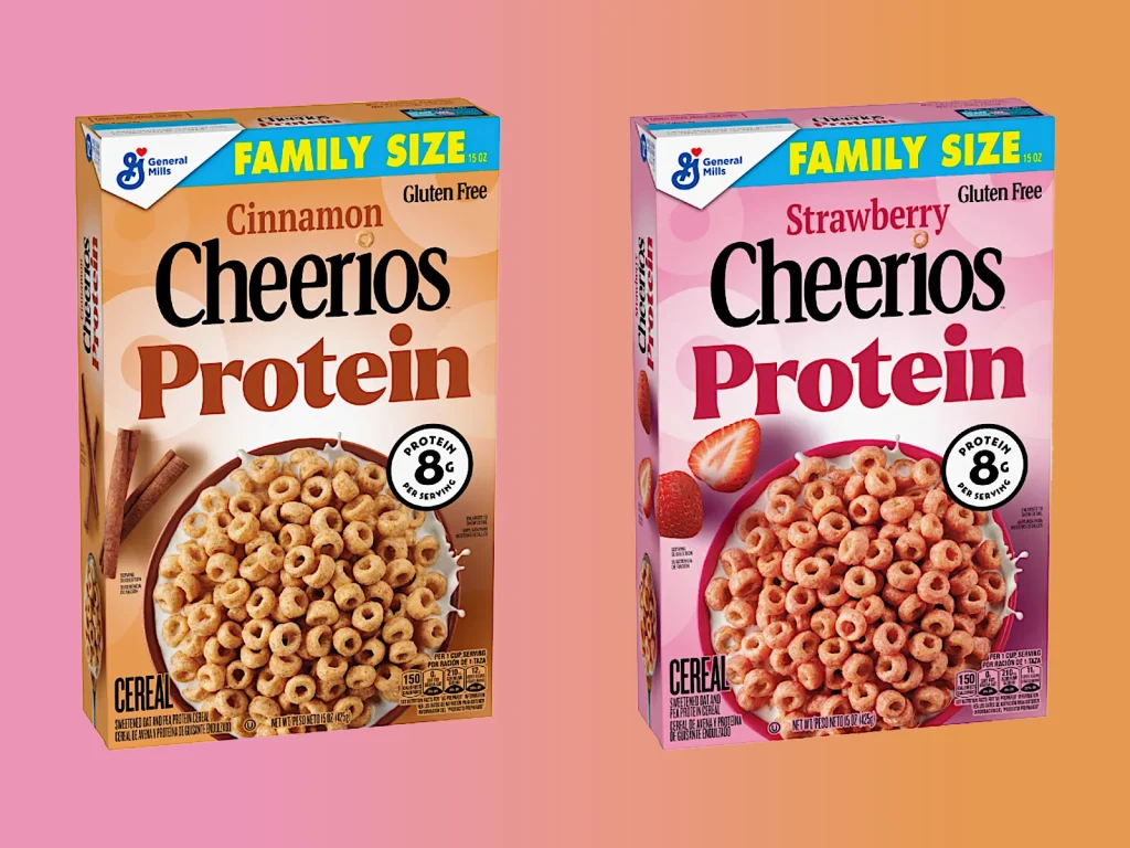
Cheerios bulks up
The news: The protein-ification epidemic has finally come for one of America’s most beloved breakfast options: Cheerios.
Big picture: Earlier this week, General Mills announced that it would be debuting two Cheerios flavors (strawberry and cinnamon) with eight grams of protein per serving compared to regular Cheerios’s three grams. The company noted that close to three-quarters of its consumers are looking to add more protein to their diets, which already compelled General Mills to introduce protein cereals including Wheaties Protein and Ghost protein cereal earlier this year.
Why it matters: America’s obsession with protein intake has been well-documented over the past several years, and brands are recently sprinting to catch up, especially in the snack sector. As documented by the food and beverage newsletter Snaxshot, protein has begun popping up in increasingly unexpected places, including a new pretzel brand, a gummy candy, and even a soda—so protein-maxxers can wash down the chalky taste of the first two snacks with an equally chalky fizzy drink.
Orangetheory rebrands
The news: Orangetheory just debuted a new visual identity that dials back on its reputation for grueling intensity. The updated assets use a juicy, optimistic color palette to emphasize how working out makes members feel, rather than just how high their heart rate can spike.
Big picture: The new branding was created by London-based DesignStudio. In an interview with Creative Boom, the studio’s strategy director noted, “Our research showed that members like the science, but they keep coming back because Orangetheory’s coaches and community make them feel so energized.” To represent that finding, Orangetheory’s revamp includes a spot featuring the diversity of its members, a new, aura-esque color palette, and a more approachable slate of fonts and charming illustrations.
Why it matters: As a company, Orangetheory has historically built its brand around its gamification of exercise, which uses heart-rate tracking to incentivise its members. But, in an era when fitness is becoming more wellness-based rather than merely appearances-driven, Orangetheory’s intense, metrics-centric marketing felt a bit dated. The new look seems like a larger effort to rebrand the company as offering a more approachable service.
“We made a name for ourselves in heart-rate-based training, but with a more holistic, total-body focus now—including the introduction of Strength50—it was the right time to resharpen what our brand stands for and how it stands out,” Orangetheory’s CEO told Marketing Dive.
‘Jingle Hoops’ Part two
The news: Over a decade after the NBA released its iconic “Jingle Hoops” Christmas ad, featuring five iconic basketball players shooting three-pointers to the tune of “Jingle Bells,” the ad is back again this year—but now, it’s animated.
Big picture: The new spot really pulls out all the festive bells and whistles, featuring famous players including Stephen Curry, Kevin Durant, LeBron James, Luka Dončić, and Jayson Tatum reimagined as Christmas action figures. The animation, which uses a stop-motion style, shows the players emerging from gifts under the tree, using a drum as a trampoline to execute a lay-up, and riding tiny Hot Wheels cars into frame. Fans’ knee jerk reactions were generally negative, though some YouTube commenters are now arguing that nostalgia was clouding their initial judgement. “This is a really good ad, pretty sure the hate’s coming from the fact the first one was too iconic,” one user wrote.
Why it matters: The revived ad is a promotion for the NBA’s upcoming Christmas Day games, which will include a brand new feature this year: a real-time animated version of an NBA game. The special coverage, called “Dunk the Halls,” will appear on ESPN2, Disney+, and ESPN+, and it will show that day’s Spurs vs. Knicks game as it takes place—just with toy players instead of the real people themselves.

Sandisk’s vibey new logo
The news: The flash drive and memory card maker Sandisk just introduced a full rebrand, and it’s kind of . . . a vibe?
Big picture: Sandisk’s new visuals are anchored in a single cornerstone: the singular square pixel. That shows up in its new 45-second spot, and in a futuristic logo, wherein each letterform incorporates the pixel shape in some way while relying on the viewer’s eye to complete its shapes. The whole thing has a glitchy cool factor. In an interview with Fast Company, the designers behind the updated look said they “asked themselves during the design process what the new logo might look like on a spaceship.”
Why it matters: The rebrand comes as Sandisk’s parent company, Western Digital, plans to spin it off into its own separate public company next year. It seems that Sandisk is ready to ditch its ‘90s-esque energy in favor of a more future-looking stance.


