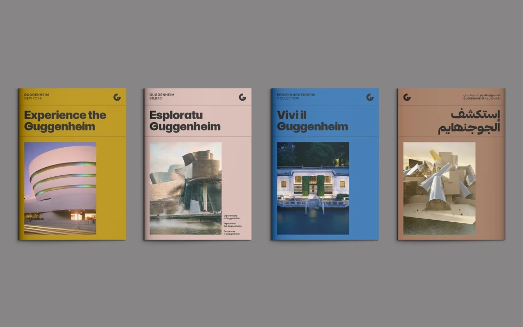
Last week, the Solomon R. Guggenheim Museum unveiled a comprehensive brand evolution ahead of the opening of its Abu Dhabi museum in 2026, including a new open source typeface, logo, and bespoke icons.
The purpose of the visual evolution was to position the museums in New York, Venice, Bilbao, and upcoming Abu Dhabi as a constellation versus a group of stars, says Tina Vaz, Chief Brand and Communications Officer at Guggenheim.
“We call ourselves an international constellation of museums, and that’s really our distinctive quality in the world, that we are four museums on three continents,” says Vaz. “Each its own star in its own right, but all connected in a set of shared values and a shared commitment to creating transformative experiences with art.”
The Vision: A Unified Brand Across Four Museums
Vaz says the concept began in 2021 in recognition of Guggenheim Abu Dhabi coming into the world.
Tasked with creating a single-tier identity system, Harry Pearce, a partner at the design studio Pentagram, led the design process, while Jane Wentworth of Jane Wentworth Associates spearheaded the strategy, collaborating with Guggenheim’s internal design team.

“Every museum’s story is different,” Pearce explains. “From Bilbao’s transformative role in its city to Venice’s more intimate scale, we needed to reflect these variations while creating a unified system that brings them all together.”
The team’s first step was to travel to the museums and interview people to better understand expectations and their task ahead. The idea of a “constellation” quickly became central to the rebranding.

“Everyone realized that the collective idea of these institutions together was such a powerful thing, rather than the individual,” Pearce says. “That really influenced the way we went about designing the structure and everything.”
With the rebrand also comes the equal positioning of all museums. Previously, the New York location stood out as the flagship, known simply as the “Guggenheim.” Now, all museums officially include their location names, reflecting their equal status under the umbrella of the international Guggenheim Foundation.

The Design: Modern, Accessible, and Versatile
At the core of the redesign is Guggenheim Sans, a open-source, geometric typeface derived from the open-source font Inter. Created in both Latin and Arabic typefaces, the Arabic script for Guggenheim Abu Dhabi was created in collaboration with Lebanon-based studio Debakir and Kuwait-based studio TB.D.
“It’s got a beautiful modernity to it,” Pearce says, explaining why the team chose to derive the new font from Inter. “It’s got a wealth of dramatic differences, from the big bold version right down to the very fine version, so it had a lovely breadth to it.”

Complementing Guggenheim Sans is the secondary typeface, Playfair, a serif font by Claus Eggers Sørensen, offering a refined contrast to Guggenheim Sans’s modernity.

This idea of a constellation is encapsulated in the new logo—a bold, abstract “G” symbol designed to gather all the museums and their stories together. The design incorporates architectural elements unique to each location, such as the spirals of New York, the curves of Bilbao, and the courtyard of Venice.
“The G gathers the constellation of museums and their art into a single identity,” Pearce says.
This is Guggenheim’s first-ever graphic symbol. Both a static mark and a dynamic design element, it’s adaptable for use in motion graphics, digital platforms, and physical branding, such as signage and merchandise.
Pentagram also developed a library of bespoke icons for wayfinding and signage across all locations. The design was informed by the geometric principles of the typeface and logo.
“For example, the angles and curves in the ‘G’ symbol informed the structural dynamics of the icons, whether it’s a directional arrow, a wheelchair symbol, or a lift indicator,” Pearce explains. “This creates a visual language that’s cohesive yet versatile.”
The layouts for assets like posters and ads are designed using a modular framework, allowing flexibility while maintaining consistency across various formats and touchpoints.
“My part building on Jane’s work was to create a unifying visual identity that gives everyone a structure, whether they’re in New York, Abu Dhabi, Bilbao Venice, that they can harmonize, but at the same time be able to express in their own particular way,” Pearce says, adding that storytelling has different nuances in different regions. “This system allows that individual expression.”
Vaz says Guggenheim’s new visual identity is being rolled out throughout 2025. The website and New York museum has already been updated; the new branding coincided with the launch of the exhibition Harmony and Dissonance: Orphism in Paris, 1910–1930.
Plans are in progress for Venice and Bilbao, while the Guggenheim Abu Dhabi will debut with the complete visual identity system when it opens in 2026.


